As someone who’s travelled to 108 countries & territories so far, while flying 35-40 airlines from 6 continents, I’ve had the chance to study airline boarding passes to great lengths, not only during layovers between flights, but also later, at home.
Being a travel & design aficionado, I go as far as keeping all boarding passes and catalogue them by various criteria, comparing the designs between airlines.
In my opinion, too few airlines pay attention and consideration to the design of their boarding pass. Lately, even the branding colours and the logo have disappeared from some ticket designs. Below is a an example from Malaysia Airlines (until recently one of the only few 5-star airlines in the world, according to Skytrax ratings) and another from ANA All Nippon Airlines, still a 5-star airline.
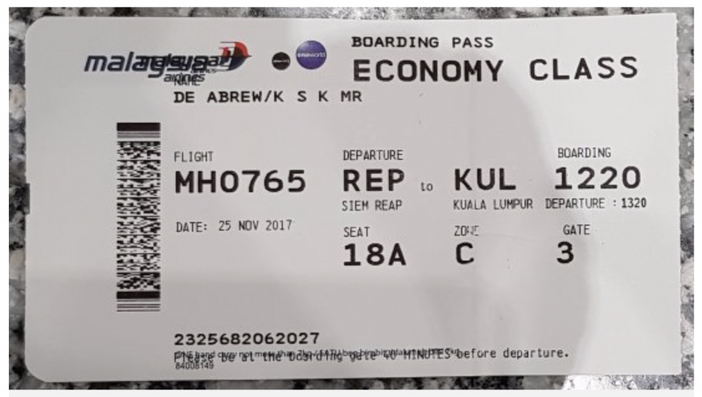
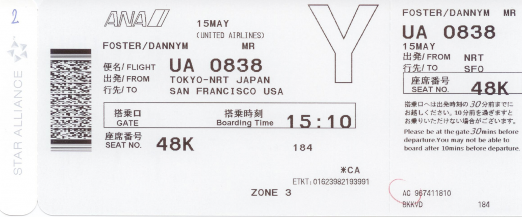
As one can easily notice, not much consideration is given to the hierarchy of information or the grouping of similar elements. In fact, the data seems haphazardly printed on both these tickets.
With examples like these, it’s honestly pretty easy to create something significantly better, as even a modicum of attention to detail would generate an improved experience.
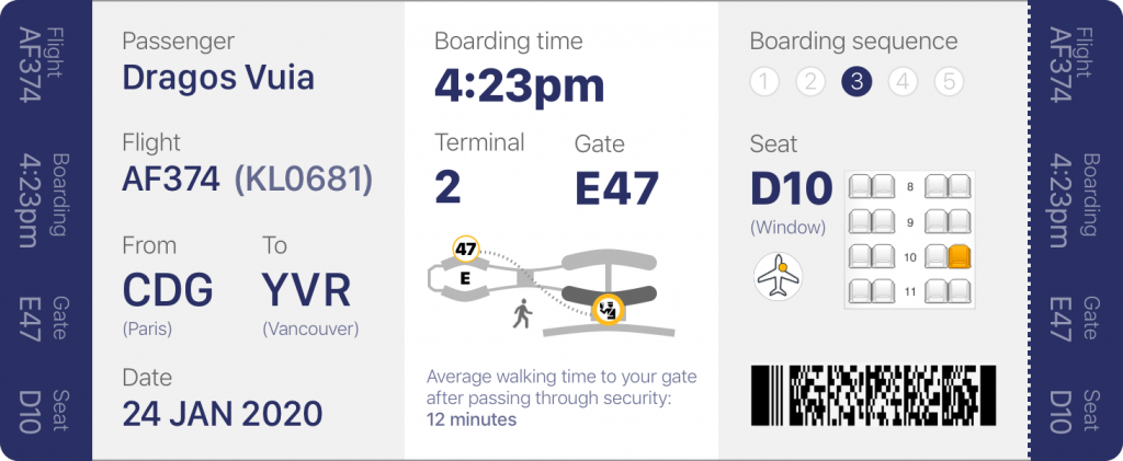
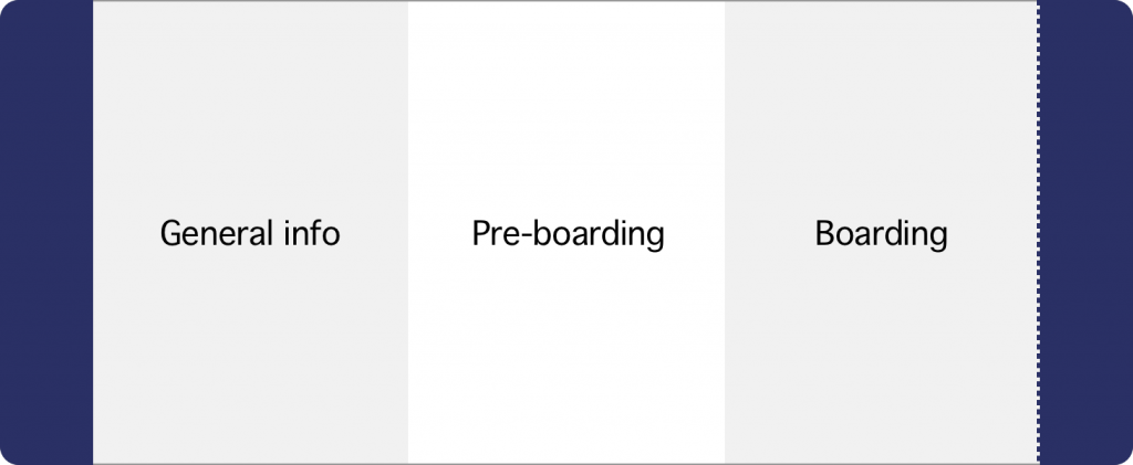
First, let’s look at the prototype below. I divided the boarding pass in 3 equal sections, framed by 2 bands of equal size at each end, which I will address later (note that one of the bands is tearable).

Now, let’s ask ourselves what are the 3 main important things to know about your flight when you are at the airport, after you just checked in. Based on my research, these are:
- General information about your flight
- How to get to the gate on time
- What to do when boarding the plane
In other words: General Info, Pre-Boarding, and Boarding.
In fact, as you already know your own name, where you’re flying and what date it is, the first section is more useful for the TSA (Transportation Security Administration) officers and personnel who double check the boarding pass before entering the passport control area.
However, an increasing number of these officers are nowadays equipped with scanners that gather all the information from the same barcode scanned by the flight attendants when boarding the plane.
General Information
Personally, I would prefer to only display the passenger info as the initial of the first name + last name (in this case, “D. Vuia”) for privacy reasons. Far too often, as people wait in line to board the plane, they keep these passes in full view, with all their names flashed boldly for prying eyes to see. For this example, however, will leave it as full first & last names.
The really important piece of information in this section is the flight number, as this is the one detail the traveller needs to know prior to starting the process of getting to the gate, as he/she checks the monitors for additional information, and also to see if the flight is on time, has any delays, or if the gate has changed.
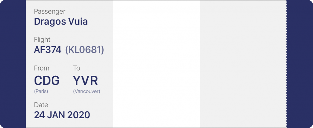
One of the improvements in this design is displaying the flight number with the original airline (in this case – Air France AF374) but also the codeshare flight KL0681 (in this case, a KLM flight). When checking the status monitors, one will notice that a flight may be displayed in 3 or 4 formats, depending on the codeshare agreements with the partner airlines. It can be something like this, however these codes would be displayed alternatively, not all at once:
AF0374 / KL0681 / DL5672
It is sometimes beneficial to have at least the second format printed on the boarding pass, as passengers often stare at the monitor visibly confused, when they see the destination and time of departure, but not the flight number they were originally familiar with.
Pre-Boarding
This is the main area of focus for any traveller before they get to the gate. The boarding time and terminal/gate numbers are the most important pieces of data and therefore they should be emphasized. I see some boarding passes having the departure time printed, but that might create confusion, and make the passenger think that’s the time when they should arrive at the gate (which, obviously, would be far too late).
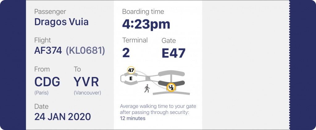
A clever basic map could be added, to help orient the passenger with regards to the direction of their gate, in relation to the security area / passport control. Also, having the sentence “average walking time to your gate after passing through security” followed by a blank row for the variable [time] printed so that the passenger would know how many extra minutes to allow for that journey, would definitely decrease the chance of tardiness. Sometimes, it might take 20 or more minutes to walk to the gate. Add to that a stop to the bathroom or a tired child, and it can become half an hour.
Boarding
So, you arrived safely at the gate, with time to spare. If it’s a large airplane, you will notice a few rows set up at the gate, with large numbers above them, usually from 1 to 5. This is the Boarding Sequence.
Airlines have finally realized that filling an airplane should be done as filling a bottle: from the bottom, up. If you invite the passengers in rows 1 to 20 to board first (assuming Economy starts at row 1 in this example), all passengers situated in rows 21 and higher would later have to crawl over the ones already boarded, as they arrange their suitcases and fuss around.
It’s best to start boarding with the rows in the back of the plane, and move towards the front. Of course, the Premium Economy, Business, First Class and passengers with children are awarded priority above all else.

The example above highlights the most important detail to remember: your seat number. It also tells you where it is located (by the window in this case), displays a small icon with a yellow dot to show on which side and which area of the plane your seat is located, and finally, shows a snippet of a map with your seat highlighted, similar to the ones online when you are given the choice to select your seat.
(For this example, I used a snippet with only a 2-2 seat configuration, but in reality, a flight from Paris to Vancouver would have a 2-4-2 or a 3-3-3 configuration to be precise).
Below all that – the infamous barcode – containing all your sensitive information, used by the gate and flight personnel to identify you.
Side bars
And now, on to the side bars, one of which is tearable. All current boarding passes have a section that is about a third of the original length of the ticket that can be torn away, which contains essentially the same information as the rest of pass. This is the stub, which you get to keep and show to the flight attendants, as they direct you to your seat when you get on the plane.

This design reduces the tearable stub to only a fraction of the original length, and adds another one at the other end, displaying vital information such as the Flight Number, Boarding Time, Gate and Seat Number vertically.
Why is that? So that when the boarding pass sits in your passport, you do not have to take it out to review the info. You can just glimpse at it at any point.
Oh, wait, but where is the branding + logo in all this? Well, as I mentioned before, more and more airlines choose to go with the generic black and white ticket, and a logo in an outlined font. In this case, the colour of the side stubs could be the airline’s branding colour and the logo displayed on the verso.
Another option is to use one of the stubs (the non-tearable one) for this purpose. Either way, the option is there. I will leave that to the airline to decide 🙂