Background
UpSkill was a project created together with my colleagues at BrainStation, Billin Yu and Catherine Mclachlan, in a 5-day sprint. Our team was tasked with creating a technical solution which addresses the Digital Divide in Canada.
Day 1
Problem
5 million people within Canada are 65 years of age or older. This age group shows the lowest levels of ICT usage and online engagement due to lacking access and digital literacy.
The participation rate in using technology is of 33% for the seniors over 65 years old. Yet the widely-held belief that many seniors cannot learn modern technologies turns out to be false. The evidence shows that older adults readily adopt and learn new mainstream technologies when a device or service is demonstrated to have immediate relevance to a senior’s important life goals.
Design Question
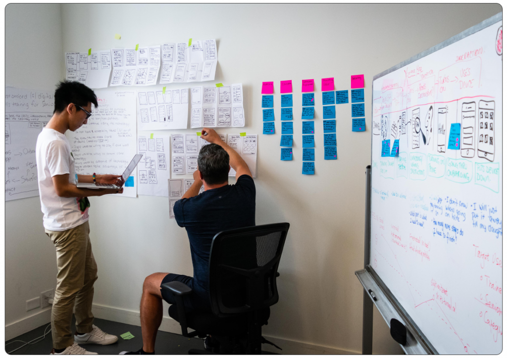
In order to come up with our design question we mapped how Seniors currently navigate through the problem space, as well as created a list of assumptions. We also conducted interviews and secondary research to understand some of the challenges that currently exist in this space. We then split our How Might We questions into epics and placed them on our User Map. From there we voted and decided on our touchpoint to solve for.
“How might we empower seniors through accessible technology and training, thus adding value to their everyday lives and fostering community engagement?”
Project Goal
Increase digital literacy rate for Canadian seniors by 15% through access to technology and digital training.
Day 2
Target
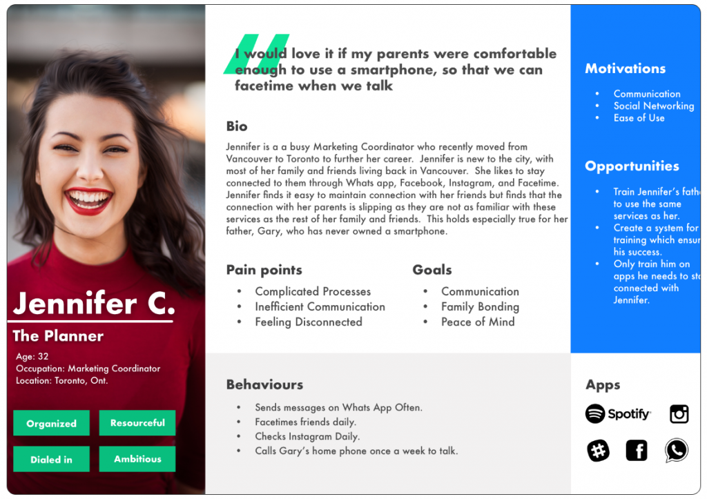
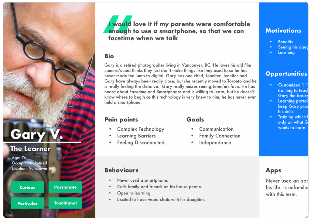
One of the challenges we faced with our problem space was that creating a solution to the problem that uses technology as a platform would be challenging for seniors to access, as the assumption is that they are currently digitally challenged. We therefore interviewed the benefactors of a potential solution (seniors) as well as persons who may be available to assist them (family members, caregivers, etc). From there we came up with 2 personas.
Storyboarding
Next we mapped out different scenario’s as to how Jennifer, our primary persona, and Gary, our secondary persona, would interact and navigate through the problem space. As I had mentioned before, there are challenges faced with our benefactor (Gary), including his current digital illiteracy. So how could we overcome Gary’s current challenges and reach our goals?
The answer to this was a scenario in which Jennifer would be the primary person who interacted with the solution with the goal of Gary benefiting. Jennifer, in this case, has purchased a smartphone for her father, Gary for his birthday. Gary had indicated that this is something he wants, but at the same time has learning challenges. Jennifer wants Gary to be successful in learning how to use his phone but is not able to teach him herself. Jennifer lives in Toronto. Gary lives in Vancouver. So how is Jennifer going to make sure Gary becomes an independent user of his smartphone?
Day 3
The Solution
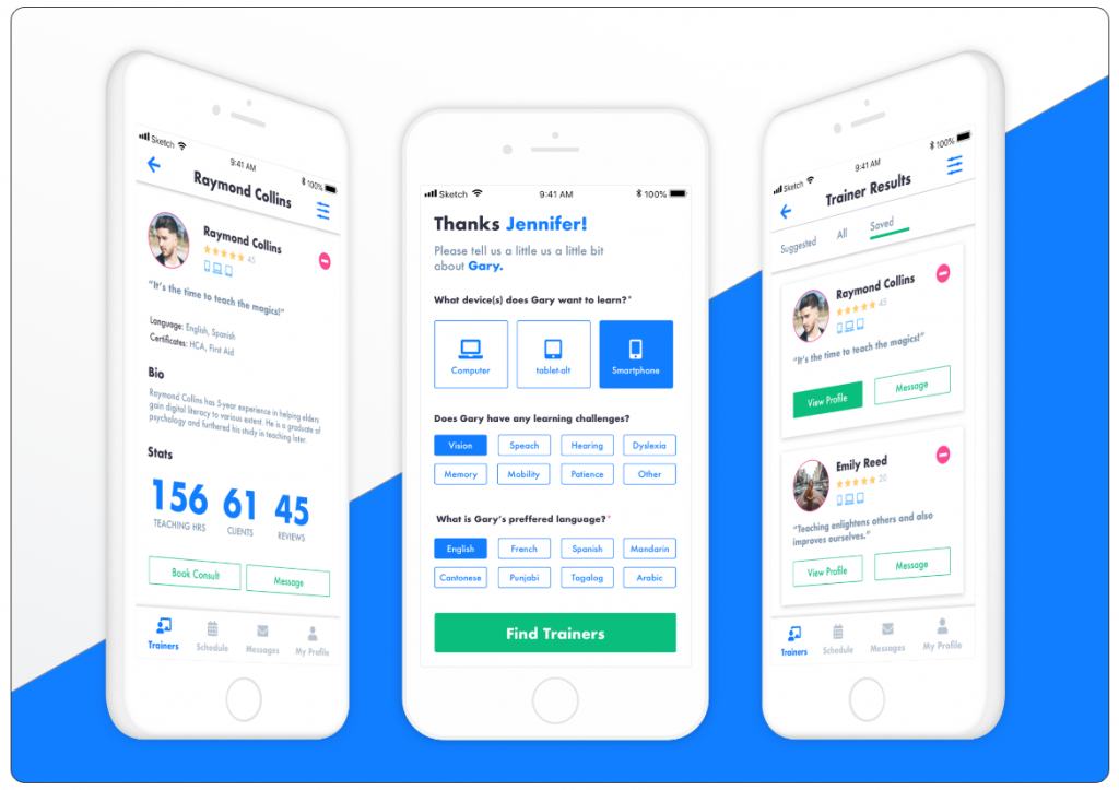
UPskill. A solution that provides a customized in person training for seniors. Through our app family members and caregivers are able to get in touch with a trainer, conduct an intake consultation, and book training for the person in need.
The trainer will then deliver the phone to Gary with everything set up according to his training and ability needs on the day which Jennifer books with them. Gary will be able to learn and practice with the trainer with the goal that he will be able to use his smartphone independently after the training is complete.
Sketches and Wireframing
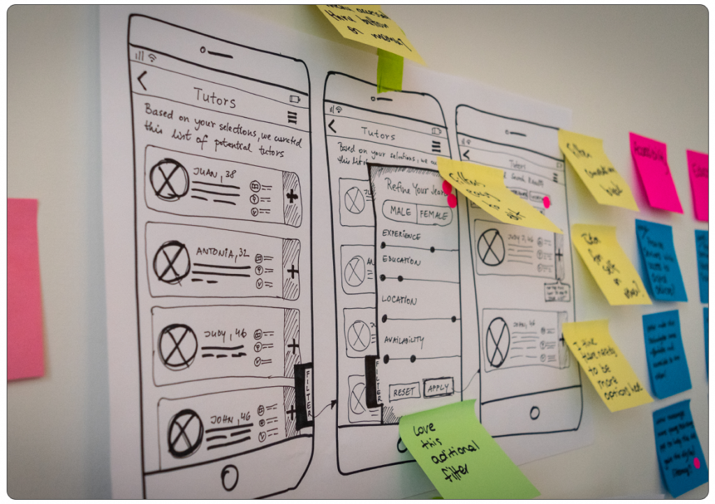
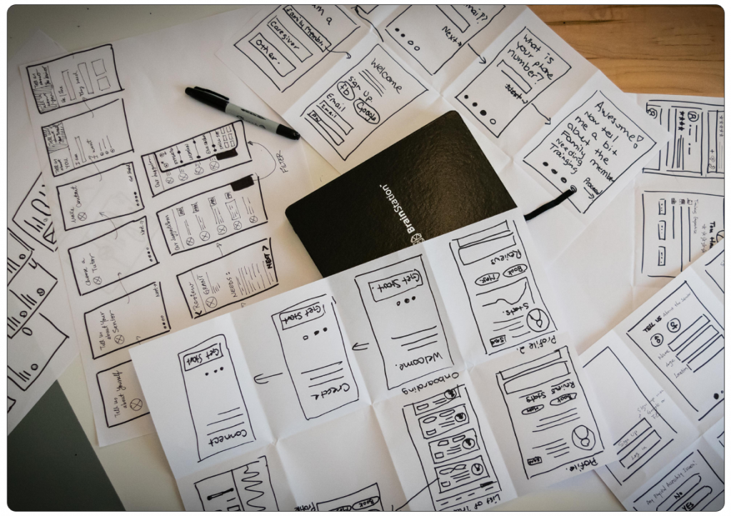
Now that the team had a solution in mind, the next steps were to begin sketching out what this solution would look like. We started sketching all possible ways that Jennifer might interact with the app.
We decided to create 2 versions for our MVP (Minimum Viable Product), onboarding Gary (the person in need of training), and searching and interacting with trainers. From there we broke off and each sketched our own version of this flow.
After this process was complete we shared our sketches with each other and gathered feedback before sharing them with colleagues in a museum style design critique. As part of this process we did not tell them what we were trying to accomplish, we just asked them to explain the design and what they thought the goals were as well as give feedback on things they liked, aspects of the design they thought might need improvement, and any questions they might have. At the end of this process we then explained our design choices. We used this feedback to make adjustments before digitizing our flow.
The Prototype
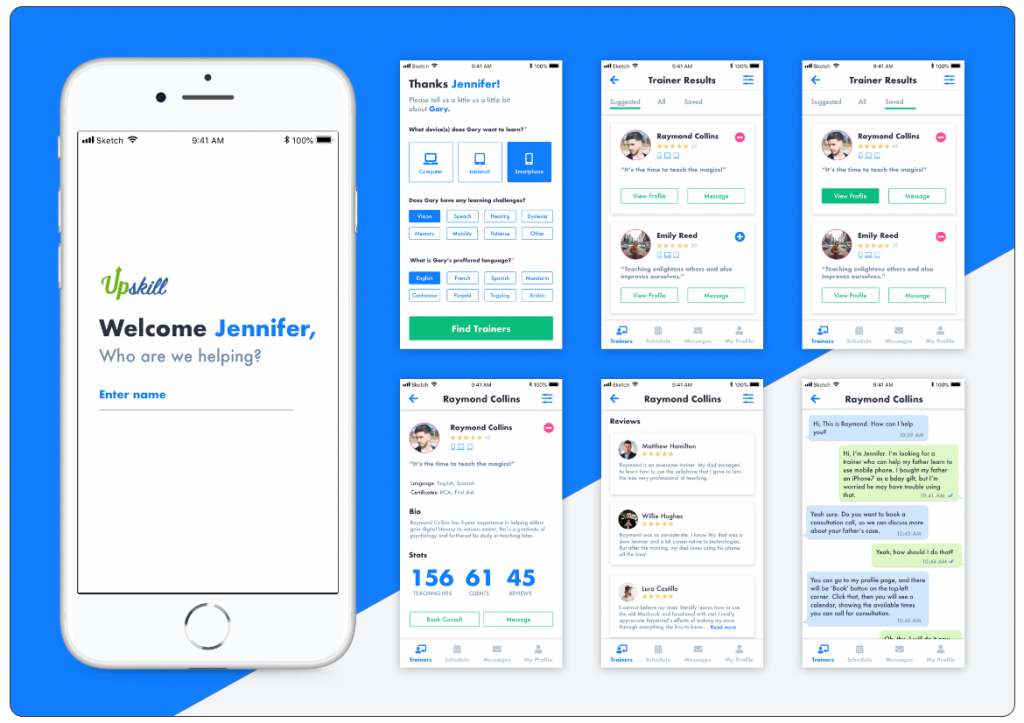
Given the amount of feedback we gathered and various rounds of sketching we had completed in the ideation phase, along with time constraints, our team made the decision to digitize in high fidelity. From there we created a clickable wireframe in Invision for user testing here: https://invis.io/CMN23LBFYBU. Keep in mind that this is still a work in progress so not all links will work at this time.
Day 4
User Testing
Once we created our prototype, we began user-testing. The scenario given to users was:
A) You have just purchased a smartphone for your Dad, whose name is Gary.
B) Your goal is to use the app to onboard Gary, who has vision issues, speaks English, and lives in Vancouver.
C) Once you have onboarded Gary, you are going to save all profiles on the suggested list of trainers that are 5 star rated.
D) You will then view this list and view a profile that is 5 stars.
E) Once you have viewed the profile the next task is to message the trainer.
Day 5
Findings
We ran 5 user tests evaluating how the user interacts with the above scenario. From the initial round of testing we were able to to gain some insight into what was working with the app and what was needing further improvement.
What users Liked:
1. User Interface: users were happy with the fidelity and color.
2. Interactions: found the interactions impressive. Liked the stats transition on the profile page.
3. Onboarding: on the onboarding page, they felt easy to fill the information by clicking the buttons.
4. Trainer Profile: found the stats and reviews helpful.
5. Empty States: found the empty state in saved profiles helpful and considerate.
What could be improved:
1. Readability: some buttons and text were too small to read for some users.
2. Onboarding: clarification on device choice. Make the option to choose multiple devices more clear.
3. Trainer’s list: the quote of trainers provides little value. Perhaps start with the qualifications.
4. Trainer’s profile: The information hierarchy needs adjustment.
UPSkill-Marketing
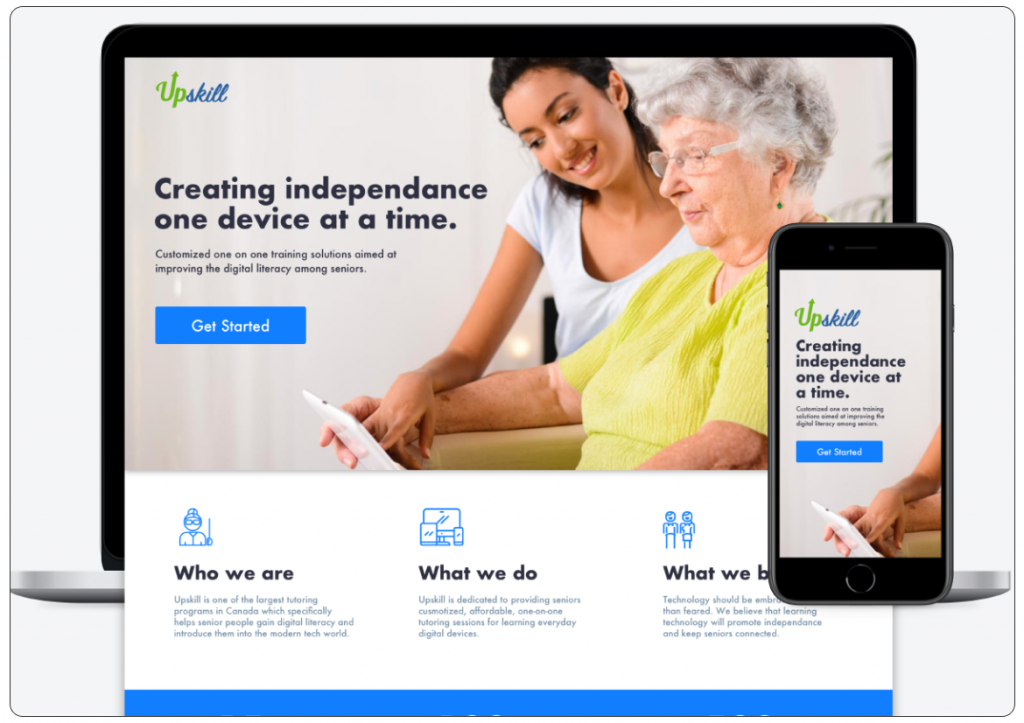
As part of the sprint our team was also tasked with creating a marketing site to promote the solution that we created. Together, our team wrote the content, sourced imagery, and designed the UI/UX for the site.
