DESIGN
A better boarding pass
As someone who’s travelled to 108 countries & territories so far, while flying 35-40 airlines from 6 continents, I’ve had the chance to study airline boarding passes to great lengths, not only during layovers between flights, but also later, at home.
Being a travel & design aficionado, I go as far as keeping all boarding passes and catalogue them by various criteria, comparing the designs between airlines.
In my opinion, too few airlines pay attention and consideration to the design of their boarding pass. Lately, even the branding colours and the logo have disappeared from some ticket designs. Below is a an example from Malaysia Airlines (until recently one of the only few 5-star airlines in the world, according to Skytrax ratings) and another from ANA All Nippon Airlines, still a 5-star airline.
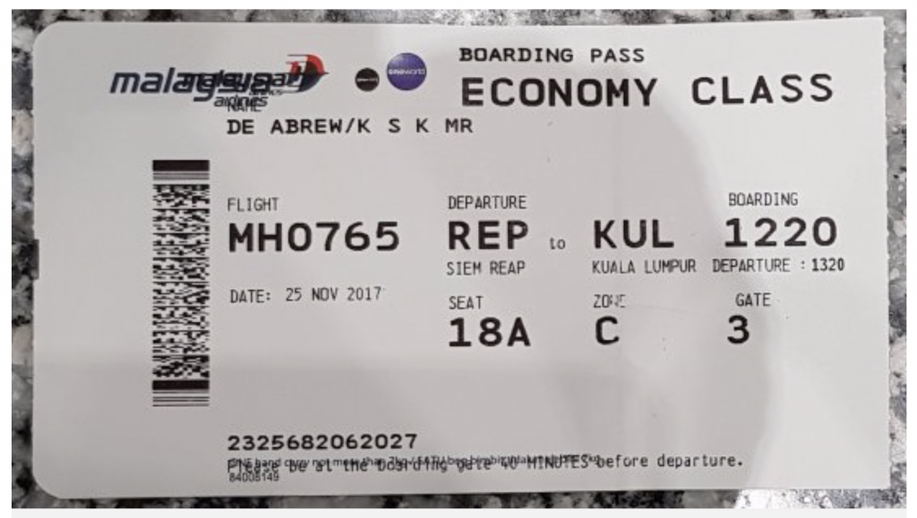

As one can easily notice, not much consideration is given to the hierarchy of information or the grouping of similar elements. In fact, the data seems haphazardly printed on both these tickets.
With examples like these, it’s honestly pretty easy to create something significantly better, as even a modicum of attention to detail would generate an improved experience.
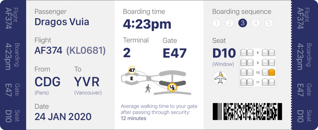
First, let’s look at the prototype below. I divided the boarding pass in 3 equal sections, framed by 2 bands of equal size at each end, which I will address later (note that one of the bands is tearable).

Now, let’s ask ourselves what are the 3 main important things to know about your flight when you are at the airport, after you just checked in. Based on my research, these are:
- General information about your flight
- How to get to the gate on time
- What to do when boarding the plane
In other words: General Info, Pre-Boarding, and Boarding.

In fact, as you already know your own name, where you’re flying and what date it is, the first section is more useful for the TSA (Transportation Security Administration) officers and personnel who double check the boarding pass before entering the passport control area.
However, an increasing number of these officers are nowadays equipped with scanners that gather all the information from the same barcode scanned by the flight attendants when boarding the plane.
General Information
Personally, I would prefer to only display the passenger info as the initial of the first name + last name (in this case, “D. Vuia”) for privacy reasons. Far too often, as people wait in line to board the plane, they keep these passes in full view, with all their names flashed boldly for prying eyes to see. For this example, however, will leave it as full first & last names.
The really important piece of information in this section is the flight number, as this is the one detail the traveller needs to know prior to starting the process of getting to the gate, as he/she checks the monitors for additional information, and also to see if the flight is on time, has any delays, or if the gate has changed.

One of the improvements in this design is displaying the flight number with the original airline (in this case – Air France AF374) but also the codeshare flight KL0681 (in this case, a KLM flight). When checking the status monitors, one will notice that a flight may be displayed in 3 or 4 formats, depending on the codeshare agreements with the partner airlines. It can be something like this, however these codes would be displayed alternatively, not all at once:
AF0374 / KL0681 / DL5672
It is sometimes beneficial to have at least the second format printed on the boarding pass, as passengers often stare at the monitor visibly confused, when they see the destination and time of departure, but not the flight number they were originally familiar with.
Pre-Boarding
This is the main area of focus for any traveller before they get to the gate. The boarding time and terminal/gate numbers are the most important pieces of data and therefore they should be emphasized. I see some boarding passes having the departure time printed, but that might create confusion, and make the passenger think that’s the time when they should arrive at the gate (which, obviously, would be far too late).

A clever basic map could be added, to help orient the passenger with regards to the direction of their gate, in relation to the security area / passport control. Also, having the sentence “average walking time to your gate after passing through security” followed by a blank row for the variable [time] printed so that the passenger would know how many extra minutes to allow for that journey, would definitely decrease the chance of tardiness. Sometimes, it might take 20 or more minutes to walk to the gate. Add to that a stop to the bathroom or a tired child, and it can become half an hour.
Boarding
So, you arrived safely at the gate, with time to spare. If it’s a large airplane, you will notice a few rows set up at the gate, with large numbers above them, usually from 1 to 5. This is the Boarding Sequence.
Airlines have finally realized that filling an airplane should be done as filling a bottle: from the bottom, up. If you invite the passengers in rows 1 to 20 to board first (assuming Economy starts at row 1 in this example), all passengers situated in rows 21 and higher would later have to crawl over the ones already boarded, as they arrange their suitcases and fuss around.
It’s best to start boarding with the rows in the back of the plane, and move towards the front. Of course, the Premium Economy, Business, First Class and passengers with children are awarded priority above all else.

The example above highlights the most important detail to remember: your seat number. It also tells you where it is located (by the window in this case), displays a small icon with a yellow dot to show on which side and which area of the plane your seat is located, and finally, shows a snippet of a map with your seat highlighted, similar to the ones online when you are given the choice to select your seat.
(For this example, I used a snippet with only a 2-2 seat configuration, but in reality, a flight from Paris to Vancouver would have a 2-4-2 or a 3-3-3 configuration to be precise).
Below all that – the infamous barcode – containing all your sensitive information, used by the gate and flight personnel to identify you.
Side bars
And now, on to the side bars, one of which is tearable. All current boarding passes have a section that is about a third of the original length of the ticket that can be torn away, which contains essentially the same information as the rest of pass. This is the stub, which you get to keep and show to the flight attendants, as they direct you to your seat when you get on the plane.

This design reduces the tearable stub to only a fraction of the original length, and adds another one at the other end, displaying vital information such as the Flight Number, Boarding Time, Gate and Seat Number vertically.
Why is that? So that when the boarding pass sits in your passport, you do not have to take it out to review the info. You can just glimpse at it at any point.
Oh, wait, but where is the branding + logo in all this? Well, as I mentioned before, more and more airlines choose to go with the generic black and white ticket, and a logo in an outlined font. In this case, the colour of the side stubs could be the airline’s branding colour and the logo displayed on the verso.

Another option is to use one of the stubs (the non-tearable one) for this purpose. Either way, the option is there. I will leave that to the airline to decide 🙂
What is an Importance / Difficulty Matrix?
The Importance / Difficulty Matrix is a quad chart with one axis for importance and another axis for difficulty. It is usually classified under Patterns & Priorities within the UX Research techniques.
What are the benefits of using an Importance / Difficulty Matrix?
- It prioritizes large amounts of data quickly
- It identifies emergent issues, concepts and themes
- Helps teams to agree on priorities more objectively
Quick guide to creating an Importance / Difficulty Matrix:
- First, draw a quad chart, either on paper or the whiteboard, labelling the horizontal axis Importance and the vertical one Difficulty.
- Place items written on sticky notes horizontally from Low to High Importance and vertically, from Low to High Difficulty.
- Open the forum to all the team members and encourage discussion or priorities.
- As the team starts brainstorming, place items in the Low Difficulty / High Importance quadrant first, followed by the High Difficulty / Low Importance last.
Review these items at a later date to see if the importance / difficulty status has changed, or remove them altogether if they have been completed.
The 4 Pillars of Data Visualization
Data vis (short for data visualization) is viewed by many disciplines as a modern equivalent of visual communication.
One of the best definitions for this field has been provided by Andy Kirk, author of Data Visualization, who defines data vis as the “representation and presentation of data to facilitate understanding”.
Why is this definition important? Because it breaks down the statement into 4 distinct categories: Representation, Presentation, Data, and Understanding. These are the four pillars of good data visualization.

Representations of data are individual displays of information. From a simple text statement to a slope chart, any grain of data can be represented one way or another. The most widely used categories are pie charts, bar charts, intermediate bar charts, line charts, waffle charts and finally, scatter plots.
When you are starting to tell a story, combining the different representations into one cohesive experience, you now have a Presentation of data.
Data can be almost anything. You can collect it from the open web, you can create your own, or acquire it by paying a data provider. The one thing to remember is that knowing your data (and what is represents) is the most important thing and at the same time, it’s the single most effective way to accurately represent it.
Finally, to facilitate Understanding is to ask yourself what is the message you want the user to take away from the presentation of data, why should they care and is the data important, or relevant? Can the user understand the data without prior knowledge of the subject?
Making an impact and giving a voice even to people who are more introverted than others, so that they can tell compelling stories, makes data vis one of the most effective ways of visual communication.
The Creative Matrix
A format for creating systematic mash-ups to generate many wide-ranging ideas is known as a Creative Matrix.
It is a concept ideation technique used in UX and Interaction Design.
Quick guide to building a Creative Matrix:
- On a whiteboard, draw a large grid, with no more than 5 rows and 5 columns, then identify each column headings, whether by categories or personas.
- For the rows, identify enablers, such as technological, cultural, etc.
- Invite various teams from different disciplines within the company and have them work simultaneously, filling each cell with ideas.
- Think about the intersections of these, writing one idea per sticky note (name, description, etc.)
- This exercise should not take more than 15 minutes, however the team members should be encouraged to generate as many ideas as possible during this time.
Among the many benefits for using a Creative Matrix are:
- It’s great for “mining” market opportunities
- Facilitates greater collaboration among various teams
- Promotes divergent thinking
- Helps respective team members generate a wide variety of ideas quickly
Net Promoter Score methodology – does it measure intention, or behaviour?
Net Promoter or Net Promoter Score (NPS) is essentially a metric that measures customer loyalty.
It was first developed in 1993 by Fred Reichheld of the management consultancy company Bain & Company. Widely praised for its corporate culture, Bain & Company has been ranked #1 in Glassdoor’s Best Places to Work awards four times – in 2012, 2014, 2017, and 2019 – setting a new record.
The Net Promoter Score is calculated based on responses to this one single question:
“How likely is it that you would recommend our company/product/service to a friend or colleague?”
The scoring for this answer is most often based on a 0 to 10 scale.
People who respond with a score of 9 to 10 are considered loyal customers and are most likely to make positive referrals to other clients. These are the Promoters.
Responses of 7 and 8 are labeled Passives, whereas those who respond with a score of 0 to 6 are labeled Detractors.
The Net Promoter Score is calculated by subtracting the percentage of customers who are Detractors from the percentage of customers who are Promoters.
Promoters (%) – Detractors (%) = NPS
There is however criticism regarding NPS, with arguments stating that the Net Promoter Score uses a scale that may not increase predictive validity and that it fails to predict loyalty behaviours.
In a recent article, Forbes magazine calls for companies to retire the NPS methodology for the following reasons:
- It doesn’t explain why a customer would recommend the firm
- It doesn’t take into account consumer demographics
- It can incentivize undesirable behaviour
Whether you are a fan or not, it is definitely a useful tool and it is used by many companies. Some of the most relevant NPS software tools in 2019 are: ZenDesk, HotJar, LiveChat and Promoter.io
Net Promoter, Net Promoter Score, and NPS are trademarks of Satmetrix Systems, Inc., Bain & Company, Inc. and Fred Reichheld.
What’s in an infographic?
This blog post first appeared on the City of Vancouver’s SAP intranet in 2011, and it was written in order to facilitate understanding among its employees regarding this up and coming field.
First off, what is an “infographic”?
People still ask me this question and for good reason: although the concept has been around since the first humans started drawing representations of their surroundings on the walls of caves, the term however is still widely unknown, with most people spelling it as two words – ‘info” & “graphic”. Other terms that have emerged lately, only add further to the confusion: diagraphics, videographics, etc. So, to put it simply – an infographic is a visual representation of information, data or knowledge.
The main goal of an infographic is to communicate information in a clear and effective manner, while engaging the viewer with visual elements that transform the act of reading a page into a whole new experience. Infographics can be used to display step-by-step processes, signs, manuals, presentations, maps, worksheets, statistics, reports, tracking tools.
The traditional way of presenting information is by writing a document (or a web page) and let the audience interpret it – hopefully in the manner intended by the author. People – however – are very visual by nature and would much rather see a sketch of a process then reading a very lengthy (and sometimes very technical) block of text. Think about it – the earliest forms of written expression began as pictographs and hieroglyphs.
Infographics can be presented by themselves – hence replacing a whole page, or in conjunction with an article (in which case it helps to further emphasize the information on that page). In some instances, more than one page can be replaced by an intuitive infographic, which saves the content strategist assigned with rewriting those pages a lot of time and saves the user from having to read through all the lengthy paragraphs.
Another aspect to keep in mind is that many of our site users do not have English as their first language. Some visit the City website even before they move to Canada, using it to decide if Vancouver will be the right choice for them. Others use it after they already established here, in search for information that is vital to their quick and smooth integration in the society. For these residents, following a page written even in the most basic English language can sometimes be a challenge. They can overlook important information or misunderstand certain facts. An simple infographic proves to be the most effective way of displaying all sorts of information and data in this case.
Each day, more and more companies realize the potential of this discipline and make it an integral part of their online presence, which proves to be very beneficial to all parties involved, as it greatly improves the user-experience and therefore gets the message across more effectively.
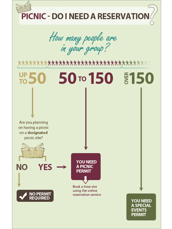
Without further due, please view the example below, which is a simple approach to an otherwise tedious process of understanding how to get a picnic permit.
Closing the digital divide gap for seniors
Background
UpSkill was a project created together with my colleagues at BrainStation, Billin Yu and Catherine Mclachlan, in a 5-day sprint. Our team was tasked with creating a technical solution which addresses the Digital Divide in Canada.
Day 1
Problem
5 million people within Canada are 65 years of age or older. This age group shows the lowest levels of ICT usage and online engagement due to lacking access and digital literacy.
The participation rate in using technology is of 33% for the seniors over 65 years old. Yet the widely-held belief that many seniors cannot learn modern technologies turns out to be false. The evidence shows that older adults readily adopt and learn new mainstream technologies when a device or service is demonstrated to have immediate relevance to a senior’s important life goals.
Design Question
In order to come up with our design question we mapped how Seniors currently navigate through the problem space, as well as created a list of assumptions. We also conducted interviews and secondary research to understand some of the challenges that currently exist in this space. We then split our How Might We questions into epics and placed them on our User Map. From there we voted and decided on our touchpoint to solve for.
“How might we empower seniors through accessible technology and training, thus adding value to their everyday lives and fostering community engagement?”
Project Goal
Increase digital literacy rate for Canadian seniors by 15% through access to technology and digital training.
Day 2
Target
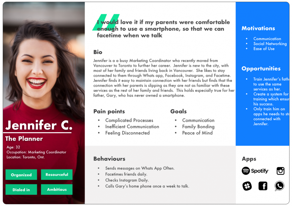
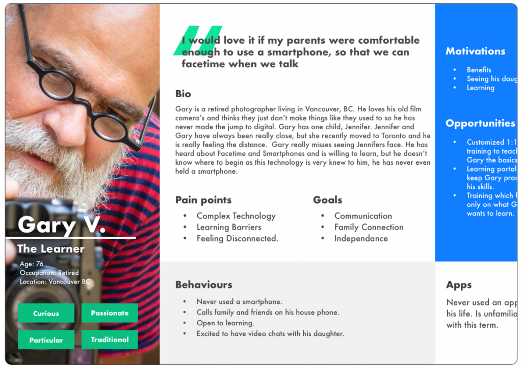
One of the challenges we faced with our problem space was that creating a solution to the problem that uses technology as a platform would be challenging for seniors to access, as the assumption is that they are currently digitally challenged. We therefore interviewed the benefactors of a potential solution (seniors) as well as persons who may be available to assist them (family members, caregivers, etc). From there we came up with 2 personas.
Storyboarding
Next we mapped out different scenario’s as to how Jennifer, our primary persona, and Gary, our secondary persona, would interact and navigate through the problem space. As I had mentioned before, there are challenges faced with our benefactor (Gary), including his current digital illiteracy. So how could we overcome Gary’s current challenges and reach our goals?
The answer to this was a scenario in which Jennifer would be the primary person who interacted with the solution with the goal of Gary benefiting. Jennifer, in this case, has purchased a smartphone for her father, Gary for his birthday. Gary had indicated that this is something he wants, but at the same time has learning challenges. Jennifer wants Gary to be successful in learning how to use his phone but is not able to teach him herself. Jennifer lives in Toronto. Gary lives in Vancouver. So how is Jennifer going to make sure Gary becomes an independent user of his smartphone?
Day 3
The Solution
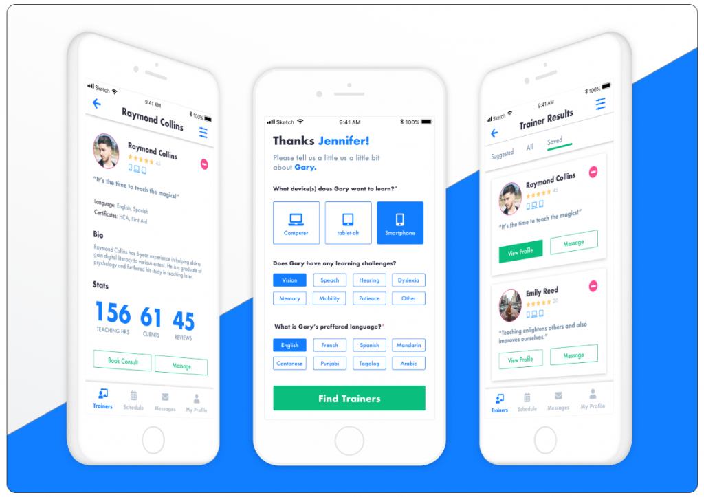
UPskill. A solution that provides a customized in person training for seniors. Through our app family members and caregivers are able to get in touch with a trainer, conduct an intake consultation, and book training for the person in need.
The trainer will then deliver the phone to Gary with everything set up according to his training and ability needs on the day which Jennifer books with them. Gary will be able to learn and practice with the trainer with the goal that he will be able to use his smartphone independently after the training is complete.
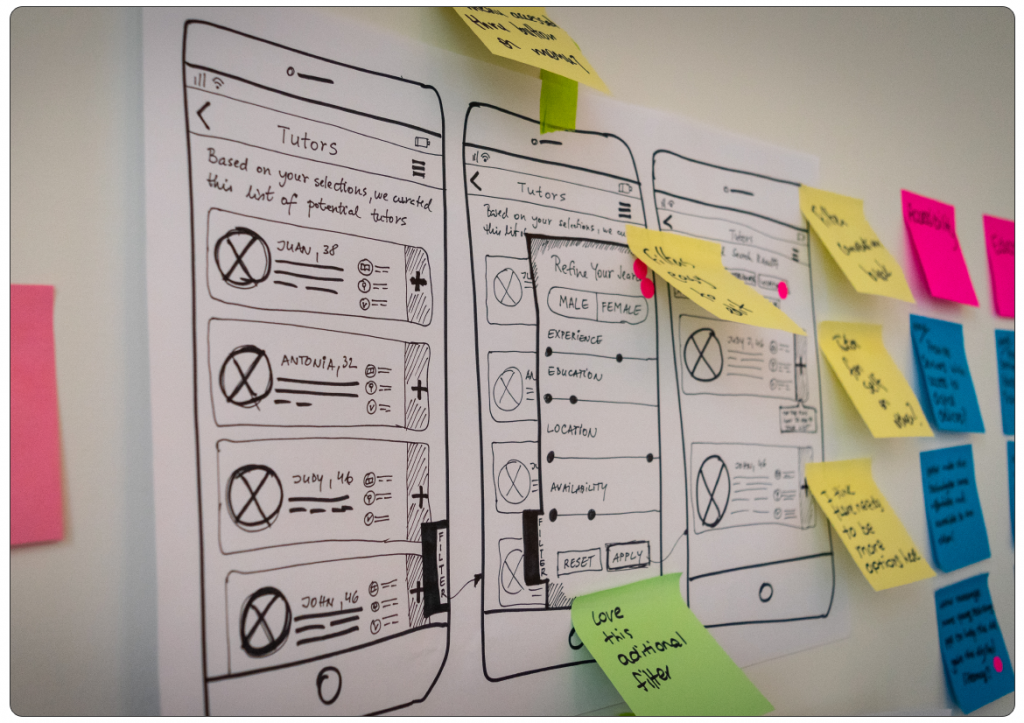
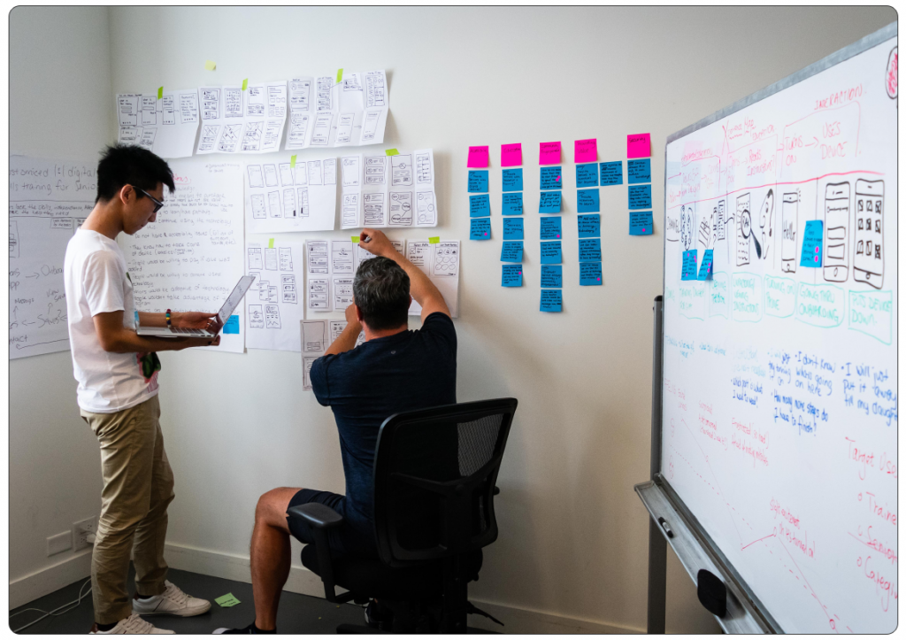
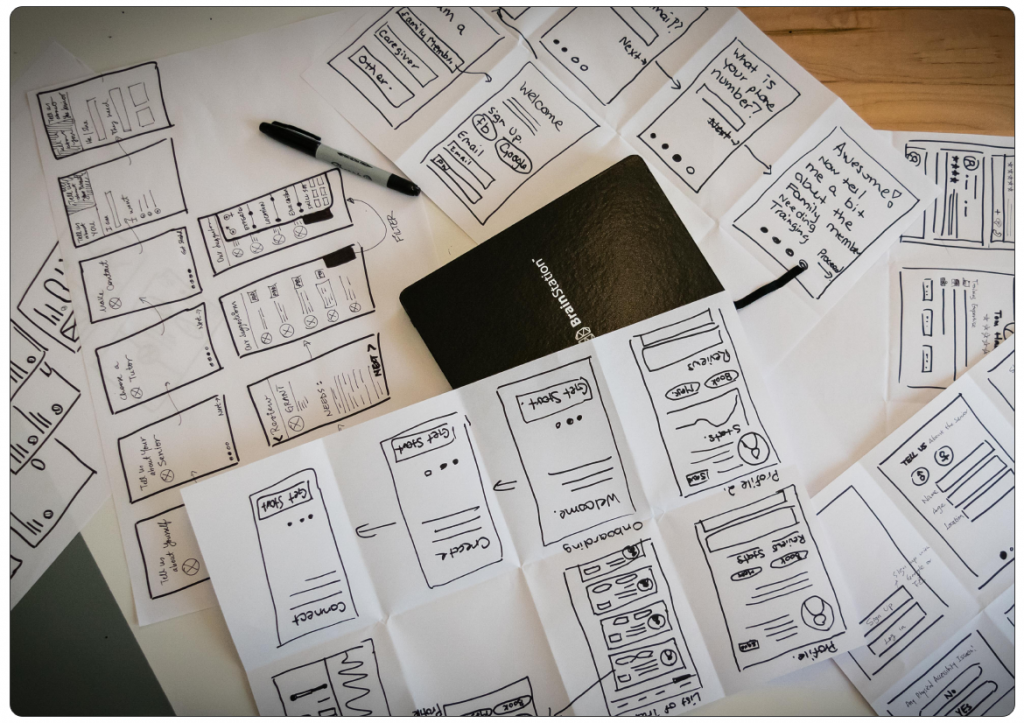
Sketches and Wireframing
Now that the team had a solution in mind, the next steps were to begin sketching out what this solution would look like. We started sketching all possible ways that Jennifer might interact with the app.
We decided to create 2 versions for our MVP (Minimum Viable Product), onboarding Gary (the person in need of training), and searching and interacting with trainers. From there we broke off and each sketched our own version of this flow.
After this process was complete we shared our sketches with each other and gathered feedback before sharing them with colleagues in a museum style design critique. As part of this process we did not tell them what we were trying to accomplish, we just asked them to explain the design and what they thought the goals were as well as give feedback on things they liked, aspects of the design they thought might need improvement, and any questions they might have. At the end of this process we then explained our design choices. We used this feedback to make adjustments before digitizing our flow.
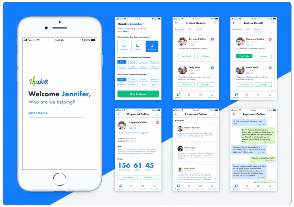
The Prototype
Given the amount of feedback we gathered and various rounds of sketching we had completed in the ideation phase, along with time constraints, our team made the decision to digitize in high fidelity. From there we created a clickable wireframe in Invision for user testing here: https://invis.io/CMN23LBFYBU. Keep in mind that this is still a work in progress so not all links will work at this time.
Day 4
User Testing
Once we created our prototype, we began user-testing. The scenario given to users was:
A) You have just purchased a smartphone for your Dad, whose name is Gary.
B) Your goal is to use the app to onboard Gary, who has vision issues, speaks English, and lives in Vancouver.
C) Once you have onboarded Gary, you are going to save all profiles on the suggested list of trainers that are 5 star rated.
D) You will then view this list and view a profile that is 5 stars.
E) Once you have viewed the profile the next task is to message the trainer.
Day 5
Findings
We ran 5 user tests evaluating how the user interacts with the above scenario. From the initial round of testing we were able to to gain some insight into what was working with the app and what was needing further improvement.
What users Liked:
1. User Interface: users were happy with the fidelity and color.
2. Interactions: found the interactions impressive. Liked the stats transition on the profile page.
3. Onboarding: on the onboarding page, they felt easy to fill the information by clicking the buttons.
4. Trainer Profile: found the stats and reviews helpful.
5. Empty States: found the empty state in saved profiles helpful and considerate.
What could be improved:
1. Readability: some buttons and text were too small to read for some users.
2. Onboarding: clarification on device choice. Make the option to choose multiple devices more clear.
3. Trainer’s list: the quote of trainers provides little value. Perhaps start with the qualifications.
4. Trainer’s profile: The information hierarchy needs adjustment.
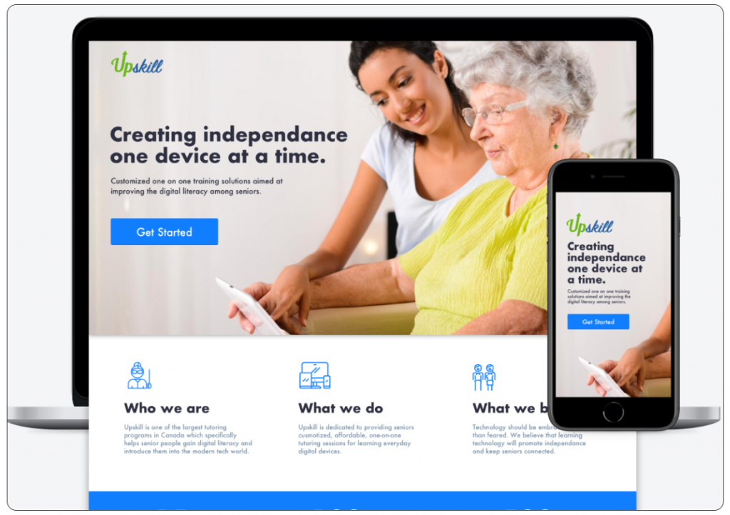
UPSkill-Marketing
As part of the sprint our team was also tasked with creating a marketing site to promote the solution that we created. Together, our team wrote the content, sourced imagery, and designed the UI/UX for the site.